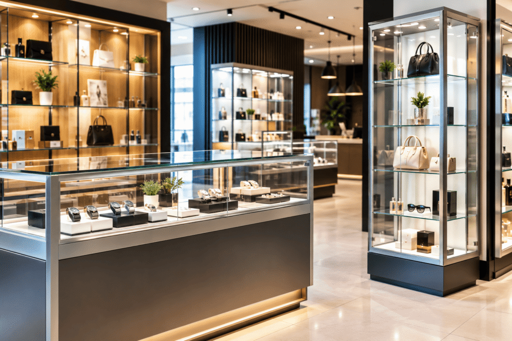
Walk into a well-designed retail store, and you might notice how easy it can feel to find products, slip between aisles, and make buying decisions. Walk into a badly planned store, and the whole experience can turn confusing even if the products themselves are actually great.
That difference is not accidental. Modern retail design blends visual merchandising, customer psychology, product positioning, and practical store fixtures so shoppers can explore and buy without too much friction.
From aluminium display counters to gondola retail solutions, each fixture can quietly add up to a smoother, more engaging customer journey.
How can Aluminium Display Counters create a strong first impression?
The entrance and the front-of-store zone are often the first thing a customer really encounters. Here, the aluminium display counters are useful because their clean, contemporary look can match modern retail spaces.
Aluminium is also visually flexible, and it can pair nicely with glass, wood, lighting, and other materials. A counter that’s designed well gives a practical place to show products, but it also helps support the store’s overall visual identity.
For specialist retailers, counters can do more than just “display”. They can form a tighter, more organised presentation area, where items are placed at easy-to-reach heights, so customers can examine things without getting overwhelmed or lost.
The real factor is placement, not just appearance. A counter should not block walking lines or make the entrance feel crowded. It should sort of steer attention while still keeping the path through the store comfortable and not too stressful.
Why does Glass Display make products more appealing?
There is a psychological reason transparent displays stay popular: they let customers see the products clearly and still keep that “something is being presented” feeling, even if it sounds obvious.
For items that require a close inspection or a premium showing, glass display solutions can be especially good. Jewellery, electronics, collectibles, cosmetics, accessories, and specialist products can all look better when they are showcased behind glass, or even inside it.
Also, glass makes light move through the space, so a shop can feel more open and visually connected. Instead of blocking products with solid structures, retailers can use transparency to spark curiosity, almost like a quiet invitation.
That said, presentation still matters; a glass case packed with too many pieces can have the opposite effect. Selective merchandising, lighting that actually suits the product, and clear product groupings – they help one item stand out rather than everything blending into one.
What role do Till Stands play in the customer journey?
The checkout area is often treated like the last stage of shopping, but in a psychological sense it can also be a merchandising moment, which is kind of funny if you think about it.
Retailers can organise that checkout zone with till stands while also giving room for carefully chosen impulse buys. Small accessories, gift ideas, seasonal products, or everyday essentials can be placed where customers naturally linger for a moment.
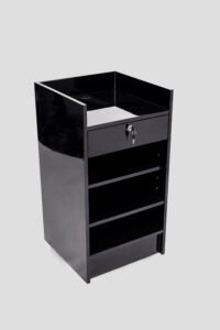
The key is not to turn the checkout into a cluttered arrangement. Customers still need to queue, pay, and leave without feeling squeezed or distracted.
When a till area is planned well, it balances efficiency with merchandising. It should keep payment straightforward while giving customers one final chance to notice something useful before they go.
How do Gondola Retail fixtures improve product discovery?
Gondola retail fixtures improve product discovery because big stores can quickly turn into a bit of a jumble, even when customers already have a general idea of what they are after. They still need quick visual cues, like something to guide them so they don’t wander through all those aisles.
With gondola retail fixtures, retailers can make organised product areas that feel more intentional, and the shopping routes become clearer. To separate the categories, gondola shelving can be set up, promotions get a stronger spotlight, and products are simply easier to scan and browse without too much effort. Some layouts even feel like a quiet trail, rather than a maze.
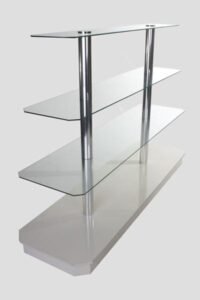
It also matters how the shelving is configured and the height you choose. When items are positioned around natural eye level, they tend to stand out more. Meanwhile, lower and upper sections can be used for specific merchandise, like slower-moving stock or seasonal extras, depending on how the store is planned.
Another underrated trick is the gondola ends. Those corners are often some of the most visible zones, so they are perfect for promotional or seasonal products. Instead of putting all the visual merchandising in one single spot, end caps create natural points of interest scattered across the shop.
How can retailers create a balanced store layout?
The “best” store is not always the one with the most products or the highest number of fixtures. It’s usually the one where shoppers can move around easily, browse, compare, and buy, without running into unnecessary obstacles or dead ends.
Retailers can aim for balance by thinking about:
- Customer flow, making routes that feel logical through main categories.
- Visibility, not blocking key displays with oversized furniture or odd placements.
- Product grouping, keeping related items together so comparison becomes smoother.
- Lighting, using illumination to pull attention toward priority displays.
- Accessibility, ensuring shelves and payment points are comfortable to approach.
- Consistency, matching fixtures to the store’s overall branding vibe and atmosphere.
In practice, a combination of aluminium display counters with other glass display units and gondola retail fixtures can work particularly well, as long as each item has a specific role, not just random placement everywhere.
Conclusion: Can the right fixtures really change a store?
Yeah, the answer is yes. Retail fixtures don’t just sit there—they affect how products look, how customers drift through the space, and how quickly they can make up their minds about buying.
Aluminium display counters can create a modern showpoint, while glass displays can put products in clearer view. Till Stands help the checkout feel more streamlined, plus they’re useful for impulse merchandising, and gondolas can bring orders to bigger assortments.
In the end, good retail layout isn’t about stuffing every empty corner. It’s about mapping the customer journey, then using the store setting so that path feels natural and easy.
When design and customer psychology actually click together, the outcome is a store that doesn’t just display goods—it encourages shoppers to look around and explore them.